Some Helpful Tools
Example:
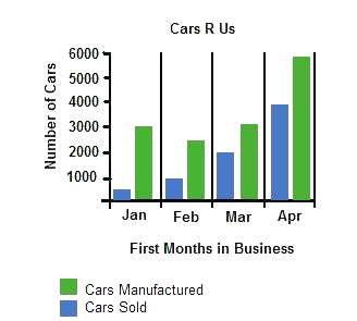
The bar graph below represents the number of cars that were manufactured and sold by Cars R Us.
How did Cars R Us sales compare to the total amount of cars manufactured during their first month of business?
The green bar tells us that 3,000 cars were manufactured. The blue bar tells us
that only 500 were sold.
This section will cover the fundamentals of reading circle, bar, and line graphs.

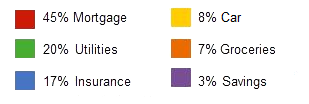
Circle Graphs
A circle graph gets its name from its shape. Each section of the graph is usually a different color and represents a particular percent.
Example:
The circle graph below represents the expenses for a household budget.
If the Nielson's total income was $179,000 last year, how much was the expense for mortgage?
The percent for mortgage (the amount spent towards the purchase of a house)
is 45%.
Begin by writing the problem as a proportion. Then solve.
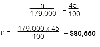
The expenses for mortgage was $80,550.
Bar Graphs
A bar graph gets its name from the bars that run up and down or across the
graph. Each bar in the graph represents a different piece of information.
The ratio of cars sold to cars manufactured for the month of January is 1:6.
Line Graphs
A line graph gets its name from the lines that can be drawn from the points that are placed on the graph.
Each point represents two values. One value extends up and down the left side of the graph. Another value runs across the bottom of the graph.
Example:
The line graph below represents the profit made during January through June of the years 2007 and 2008.
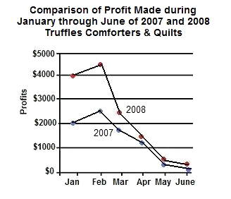
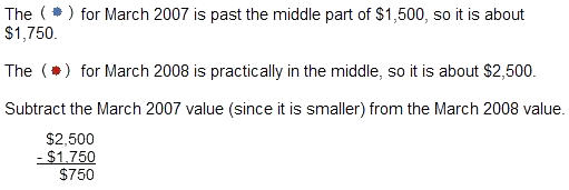
There was a $750 increase in profit in March 2008 when compared to March 2007.
Truffles Comforters & Quilts has been in business for 2 years.
Compare the profit made in March 2007 to the profit made in March 2008. What is the difference?

Math: Graphs - Tutorial